When buying for the store we look for beautiful objects with style and functionality. Rarely do I ask myself is the colour is right. Yes, the colour must be appealing and the tone is usually similar to other things we sell. However, I never stress too much about colour because I know that colour is extremely subjective to its surroundings. The more important consideration when choosing for your home too is to consider how the colour of an object will jive with larger elements in your home, like your floors, walls and sofa or what colours will be next to it. Yes, of course you should like the colour but more importantly how will that colour play against the other colours in your space. A colour on its own in a cushion, rug or piece of furniture can sing or clash depending on what it is near. Some of my all-time winning colour combinations are below. When I speak of these colours, I generally don't mean the truest form of them. It can be muddied colours or undertones, like orange undertones in oak flooring or yellow in brass or gold:
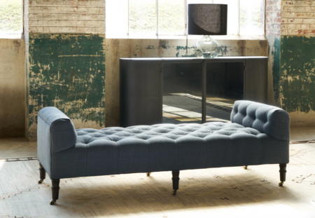
Blue & Brown
Yellow & Grey
Blue & Orange
Black, White & Green
Green & Brown
Taupe & Copper
Why Colour Matters More Than You Think
Colour is one of the most powerful tools in interior design—yet it’s often the most misunderstood. It’s not about choosing a “favourite colour” or following trends. It’s about creating a feeling.
The best interiors don’t rely on bold statements. Instead, they use colour quietly—layered, tonal, and intentional. At Gild & Co., we always come back to one principle: timeless homes are built on restraint and cohesion, not contrast and chaos.
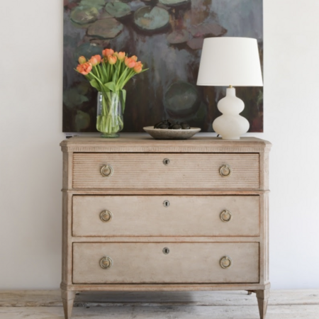
Start with a Foundation: Neutrals Done Properly
A well-designed home almost always begins with a neutral base—but neutral doesn’t mean boring.
Think:
- Warm whites instead of stark whites
- Soft taupes, linens, and stone tones
- Muted greys with depth
These tones create a backdrop that allows everything else—furniture, lighting, art—to shine.
Pro tip: Avoid cool, flat greys. Warmer neutrals feel more inviting and photograph beautifully.
How to Choose a Timeless Colour Palette for Your Home
Choosing the right colour palette for your home doesn’t mean following trends—it means creating a layered, cohesive environment that feels warm and enduring. The best interiors rely on neutral foundations, natural materials, and subtle tonal variation rather than bold contrasts or overly saturated hues.
At Gild & Co., we believe that colour works best when it’s integrated throughout a space. From hand-knotted rugs and linen upholstery to carefully selected lighting and antiques, each element contributes to an overall palette that feels collected and intentional.
If you’re designing a space, start with foundational pieces like a neutral sofa, a vintage-inspired rug, or a statement table lamp, and build outward. These anchor pieces naturally introduce colour in a way that feels effortless and refined.
Explore our collection of:
By focusing on quality materials and a restrained palette, you can create a home that feels both current and timeless.
Leave a comment
Recent articles
View all
Carolyn Bessette Kennedy’s 90s Minimalist Style
Lighting Matters More Than You Think
How We Source Our Mirrors at Gild & Co.